Why automated accessibility testing misses half your problems
Automated checks are useful, fast, and necessary. They are also incomplete by design.
Table of contents
- The uncomfortable truth about automated accessibility testing
- What automated tests are good at
- Where automation breaks down
- The false comfort of a high score
- The categories most often missed
- 1. Keyboard and focus behavior
- 2. Meaningful names and descriptions
- 3. Error handling
- 4. Visual adaptation
- 5. Content clarity
- A better testing workflow
- Run automated checks continuously
- Add manual keyboard testing
- Test with at least one screen reader
- Review content and states
- Include disabled users when the stakes are high
- How to interpret automated results responsibly
- The practical standard: automate the obvious, manually test the experience
The uncomfortable truth about automated accessibility testing
Automated accessibility testing is one of the best habits a web team can build. It catches missing form labels, low-contrast text, invalid ARIA, duplicate IDs, empty buttons, and other defects that should never reach production.
It is also routinely misunderstood.
A passing automated accessibility report does not mean a page is accessible. It means the tool did not find the subset of problems it knows how to detect. That subset is valuable, but limited. Many accessibility failures depend on meaning, order, intent, context, and human interaction. Software can inspect markup. It cannot reliably understand whether the experience works for a person using a screen reader, keyboard, magnification, voice control, captions, or cognitive support.
This is why the claim that automated testing misses about half your problems is not cynical. It is generous. Some issue categories are highly automatable. Others are barely automatable at all.
The practical answer is not to abandon automated tools. It is to put them in the right place: early, often, and as part of a wider testing workflow.
What automated tests are good at
Automated tools are excellent at finding deterministic failures. If a rule can be expressed as a machine-readable condition, a scanner can usually check it quickly and consistently.
Common examples include:
- Images with missing
altattributes - Form inputs without associated labels
- Buttons without accessible names
- Text that fails contrast thresholds
- Invalid ARIA attributes or roles
- Heading levels that skip in suspicious ways
- Landmarks that are missing or duplicated
- Links with empty accessible names
- Tables without basic structure
These checks are worth automating because humans are bad at repetitive inspection. Nobody should manually scan every page for missing labels if a tool can catch them in milliseconds.
Automated checks also make accessibility easier to discuss in engineering workflows. A failing test in CI is concrete. A warning in a pull request is timely. A trend line across templates gives a team something to improve.
The problem starts when teams treat these checks as proof of accessibility rather than proof of basic hygiene.
Where automation breaks down
Accessibility is not only a property of code. It is a property of use.
A tool can tell you whether an image has alt text. It usually cannot tell you whether that alt text is useful. An image of a product might need a detailed description on a product page, no description in a decorative hero, and a completely different description in a help article. The correct answer depends on context. That is why teams need editorial guidance like a pragmatic approach to image alt text, not only a linter rule.
The same problem appears everywhere.
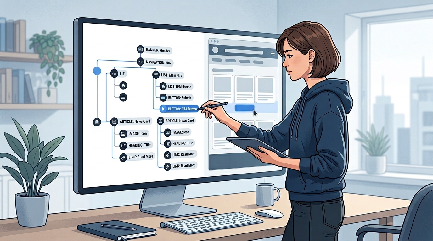
A scanner may confirm that every button has an accessible name. It cannot always tell whether the name makes sense. A page with five buttons named Submit may pass a basic rule and still be miserable for screen reader users. A modal may have the right ARIA attributes but trap focus incorrectly. A custom dropdown may look compliant in static markup and fail the moment someone tries to use it with a keyboard.
Automation struggles with questions like:
- Does the focus order match the visual and logical order?
- Can every task be completed with a keyboard alone?
- Are error messages specific, timely, and associated with fields?
- Does the page still work when text is resized or zoomed?
- Is the reading order sensible for assistive technology?
- Are instructions understandable without relying on color or position?
- Do captions, transcripts, and labels actually communicate the content?
- Does a component behave predictably across states?
These are not edge cases. They are central to accessibility.
The false comfort of a high score
Accessibility scores are seductive because they compress a messy subject into a number. A dashboard says 98. A report shows green checks. The release feels safer.
But the score is only measuring what the tool measures.
This is similar to performance testing. A Lighthouse report can reveal important problems, but it is not the same as watching a real user struggle through a slow checkout on a mid-range phone. If your team already uses performance audits, the same mindset applies: read the report carefully, then prioritize the findings that affect real users. We have written about that distinction in how to read a Lighthouse report without panicking.
Accessibility reports require the same restraint. A clean automated scan is a starting point. It is not a certificate.
The risk is especially high when teams run scans only against static pages. Modern interfaces are stateful: menus open, drawers slide, toasts appear, validation messages update, tabs switch panels, filters rewrite content, and authentication changes everything. Many serious accessibility defects live in those interactions.
If your scanner only sees the initial DOM, it is missing the product.
The categories most often missed
1. Keyboard and focus behavior
Keyboard access is one of the clearest examples of why automation is insufficient.
A tool can detect whether an element is focusable. It may catch positive tabindex values or obvious focus traps. But it cannot reliably judge whether the tab sequence feels coherent, whether focus moves to the right place after an action, or whether a dismissed component returns focus to the trigger.
You need a human to press Tab, Shift+Tab, Enter, Space, Escape, and arrow keys through the actual workflow.
This is particularly important for custom controls. Native HTML elements carry years of accessibility behavior for free. Rebuilding buttons, selects, checkboxes, menus, and dialogs with divs means your team now owns that behavior. If you are reviewing interactive components, start with a short checklist for accessible web buttons and extend the same discipline to every custom control.
2. Meaningful names and descriptions
Automated tools can detect absence. They are much worse at detecting quality.
A link named Read more may technically have an accessible name. A button labeled OK may be valid. A form hint may be present. But are they meaningful in context? Often not.
Accessible names should tell users what will happen or what the element represents. That requires judgment. It also requires testing with the interface, not just the code.
3. Error handling
Forms are full of accessibility failures that scanners only partially catch.
A tool may flag an unlabeled field. It may not catch that the validation message appears too late, disappears too quickly, is not announced to screen readers, or says Invalid input when it should say Password must be at least 12 characters.
Good error handling is interaction design. It needs manual testing and, ideally, user testing.
4. Visual adaptation
WCAG includes requirements around resizing text, reflow, contrast, spacing, and not relying on a single sensory cue. Some of this can be checked automatically, but the real question is whether the interface remains usable under changed conditions.
Try 200% zoom. Try browser text resizing. Try high contrast or forced colors mode. Try narrow viewport widths. Try reduced motion. Many sites that look polished at default settings break quickly when users assert their preferences.
5. Content clarity
No automated accessibility tool can fully assess whether content is understandable.
It can flag missing headings or vague link text. It cannot know whether the page explains a process clearly, whether labels match user expectations, or whether dense copy creates avoidable cognitive load.
Accessibility is not only about assistive technology compatibility. It is also about reducing friction for people under stress, using unfamiliar language, dealing with attention constraints, or navigating complex tasks.
A better testing workflow
A balanced accessibility workflow has layers.
Run automated checks continuously
Use automated tests in development, pull requests, component previews, and CI. They should be boring, fast, and non-negotiable. New missing labels and invalid ARIA should not require a quarterly audit to discover.
Treat these failures like linting failures. The goal is not heroics; it is preventing regressions.
Add manual keyboard testing
For every meaningful user flow, test without a mouse. This includes navigation, search, account creation, checkout, filtering, modals, menus, and form submission.
At minimum, verify:
- Every interactive element is reachable
- Focus is visible at all times
- Focus order is logical
- The expected keys work
- Escape dismisses dismissible overlays
- Focus is managed after opening and closing components
- No keyboard trap exists
This single habit catches a large class of issues automated scans miss.
Test with at least one screen reader
You do not need to become an expert screen reader user to learn useful things. You do need humility. Screen reader testing has a learning curve, and beginners can misdiagnose problems.
Still, basic testing with VoiceOver, NVDA, or JAWS can reveal broken names, confusing reading order, unannounced updates, and landmark problems that a scanner may not catch.
Pair this with semantic HTML. The more native elements you use, the less fragile your accessibility becomes.
Review content and states
Check empty states, loading states, error states, disabled states, success messages, and permission failures. Accessibility bugs often hide outside the happy path.
Also review the actual words. Labels, headings, instructions, and error messages are part of the interface.
Include disabled users when the stakes are high
For critical flows, manual expert review is not enough. User testing with disabled participants finds problems that teams do not anticipate. This is especially important for public services, healthcare, finance, education, and any flow where exclusion has serious consequences.
Automated testing scales. Human testing understands.
How to interpret automated results responsibly
Do not ask, Did we pass?
Ask better questions:
- What issue categories can this tool detect?
- Which templates and states did it scan?
- Did it run after interactions, or only on initial load?
- Are violations grouped by root cause or counted repeatedly?
- Which failures block users from completing tasks?
- What still requires manual review?
This framing changes the conversation. Automated tools become evidence, not authority.
It also helps teams avoid busywork. Fixing a single component may remove hundreds of repeated violations. Conversely, a page with only one reported issue may still contain a severe keyboard trap. Counts are not impact.
The practical standard: automate the obvious, manually test the experience
The best accessibility teams are not anti-tool. They are anti-fantasy.
They automate what machines can detect reliably. They manually test what depends on behavior and meaning. They use standards like WCAG as a shared baseline, not as a substitute for using the product.
If your current process is only an automated scan before launch, improve it in this order:
- Add automated checks earlier in development.
- Manually keyboard-test core flows.
- Review names, labels, errors, and instructions.
- Test common components with a screen reader.
- Bring in expert and user testing for high-risk journeys.
That is not a perfect process. It is a realistic one. And it will find far more than a green accessibility score ever will.
Frequently asked questions
How much can automated accessibility testing actually catch?
Does passing an automated scan mean we meet WCAG?
What is the most important manual test to add first?
Do small websites need screen reader testing?
Should automated accessibility tests block deployment?
Sources & further reading