A developer guide to ARIA labels that actually help
ARIA labels are not a magic accessibility layer. Used well, they make controls understandable. Used casually, they hide useful text and create confusing interfaces.

Table of contents
- ARIA labels are for names, not apologies
- The accessible name, in plain English
- First rule: prefer native HTML and visible labels
- When `aria-label` is the right tool
- When `aria-label` is the wrong tool
- Reach for `aria-labelledby` when visible text already exists
- Use `aria-describedby` for help text, not the name
- Repeated controls need unique names
- Do not label everything
- Check the computed name, not just the code
- A practical review checklist
- The quiet discipline of good ARIA
ARIA labels are for names, not apologies
ARIA is useful, but it is often used as a patch for unclear HTML. That is where teams get into trouble.
The most common example is aria-label. It looks harmless: add a string, satisfy a linter, move on. But an accessible name is not decoration. It is the name many assistive technologies expose to users when they navigate by buttons, links, form fields, headings, landmarks, and controls.
If that name is vague, duplicated, stale, or different from the visible label, the interface becomes harder to use. Sometimes worse: aria-label can override better text that was already present in the DOM.
The goal is not to add more ARIA. The goal is to make the name, role, state, and purpose of each interface element clear.
The accessible name, in plain English
Most interactive elements have an accessible name. Screen readers use that name to announce what the element is.
For example:
<button>Save changes</button>A screen reader can announce something like: “Save changes, button.” The role comes from the native button element. The name comes from the text inside it.
That is the ideal case: visible text and accessible name match.
ARIA labeling attributes become useful when the visible interface does not provide a complete name, or when the name must come from another element. The main attributes are:
aria-label: provides a string directly on the element.aria-labelledby: points to one or more elements whose text becomes the name.aria-describedby: points to supporting description text, not the main name.
Those three are related, but not interchangeable.
First rule: prefer native HTML and visible labels
If you can put visible text on the control, do that first.
This is better:
<button>Delete invoice</button>Than this:
<button aria-label="Delete invoice">
  <svg aria-hidden="true" focusable="false">...</svg>
</button>
The second pattern is valid for an icon-only button. But if the design can tolerate visible text, visible text helps everyone: screen reader users, speech recognition users, people with cognitive load, people scanning quickly, and people using translation tools.
This is a recurring theme in accessibility work. Native HTML and visible affordances solve more problems than hidden metadata. The same principle applies to button semantics more broadly; if your team is auditing UI controls, our checklist for accessible web buttons is a good companion to this guide.
When aria-label is the right tool
Use aria-label when an element needs an accessible name and there is no suitable visible text to reference.
The classic case is an icon-only button:
<button aria-label="Search">
  <svg aria-hidden="true" focusable="false" viewBox="0 0 24 24">
    <!-- icon -->
  </svg>
</button>
This is reasonable. The visible icon suggests search, but the SVG path itself does not provide a reliable name. The aria-label supplies one.
Other good cases include:
- A close button represented only by an “X”.
- A navigation landmark that needs a more specific name, such as
aria-label="Product". - A repeated control where visible context is not part of the button text.
For example:
<nav aria-label="Primary">
  ...
</nav>

<nav aria-label="Footer">
  ...
</nav>
Both are navigation landmarks, but their labels help users distinguish them when moving by landmarks.
When aria-label is the wrong tool
Do not add aria-label just because a test says an element needs a label. Fix the markup first.
Bad:
<div role="button" tabindex="0" aria-label="Submit">Submit</div>Better:
<button>Submit</button>The first example creates unnecessary work. You now have to recreate keyboard behavior, disabled states, form behavior, and expectations that native buttons already provide.
Also avoid using aria-label to rename visible text in a way that changes meaning.
<button aria-label="Delete invoice">Remove</button>This looks minor, but it can confuse users who rely on speech input. If a visible button says “Remove,” but its accessible name is “Delete invoice,” a user trying to say “click Remove” may not get the expected result. WCAG’s “label in name” requirement exists for exactly this reason: visible text should generally be contained in the accessible name.
A better version:
<button aria-label="Remove invoice">Remove</button>Often better still:
<button>Remove invoice</button>Reach for aria-labelledby when visible text already exists
If the label text is already on the page, aria-labelledby is usually better than aria-label.
Example:
<h2 id="billing-title">Billing address</h2>
<section aria-labelledby="billing-title">
  ...
</section>
The section’s accessible name now comes from the visible heading. You avoid duplicating strings, which reduces translation mistakes and stale labels.
This is especially useful for form groups:
<fieldset aria-labelledby="shipping-speed-title">
  <legend id="shipping-speed-title">Shipping speed</legend>

  <label>
    <input type="radio" name="shipping" value="standard">
    Standard
  </label>

  <label>
    <input type="radio" name="shipping" value="express">
    Express
  </label>
</fieldset>
In many cases, the native legend is enough without ARIA. The point is that visible labels should lead. ARIA should connect existing meaning, not create a second private version of it.
Use aria-describedby for help text, not the name
A description is not a label.
Consider this field:
<label for="password">Password</label>
<input id="password" type="password" aria-describedby="password-help">
<p id="password-help">Use at least 12 characters.</p>
The accessible name is “Password.” The description is “Use at least 12 characters.” A screen reader may announce both, but they serve different purposes.
Do not do this:
<input type="password" aria-label="Use at least 12 characters">That names the field after the instruction, not the concept. A user navigating a form wants to know what the field is first, then what constraints apply.
This distinction matters in error states too:
<label for="email">Email</label>
<input
  id="email"
  type="email"
  aria-invalid="true"
  aria-describedby="email-error"
>
<p id="email-error">Enter an email address in the format [email protected].</p>
The label stays stable. The error message becomes supporting context.
Repeated controls need unique names
Lists and cards are where ARIA labels often become necessary.
Bad:
<button>Delete</button>
<button>Delete</button>
<button>Delete</button>
A screen reader user navigating by buttons may hear “Delete, button” three times with no context.
Good:
<button aria-label="Delete report: Q4 revenue">Delete</button>
<button aria-label="Delete report: Hiring plan">Delete</button>
<button aria-label="Delete report: Vendor list">Delete</button>
This is a legitimate use of aria-label: the visible text remains concise, while the accessible name includes the object.
But use this pattern carefully. If the object name is visible nearby, aria-labelledby may be more maintainable:
<article>
  <h3 id="report-q4">Q4 revenue</h3>
  <button aria-labelledby="delete-q4 report-q4" id="delete-q4">Delete</button>
</article>
The accessible name becomes “Delete Q4 revenue.” This avoids duplicating the report title in an attribute.
Do not label everything
Not every element needs an ARIA label.
Static text usually does not. Decorative icons do not. Containers do not, unless they have a meaningful landmark or widget role. Over-labeling can make a page noisy and harder to navigate.
For images, use the image-specific model: meaningful images need useful alt; decorative images need empty alt="". Do not use ARIA labels as a substitute for good image text. If your team is mixing those concepts, revisit pragmatic image alt text and separate image alternatives from control names.
A common mistake is giving every SVG an aria-label. If the SVG is inside a button and the button already has a name, the icon should usually be hidden from assistive tech:
<button aria-label="Open menu">
  <svg aria-hidden="true" focusable="false">...</svg>
</button>
Otherwise, the user may hear redundant or strange announcements depending on the browser and assistive technology combination.
Check the computed name, not just the code
Accessibility bugs often survive code review because the markup looks plausible.
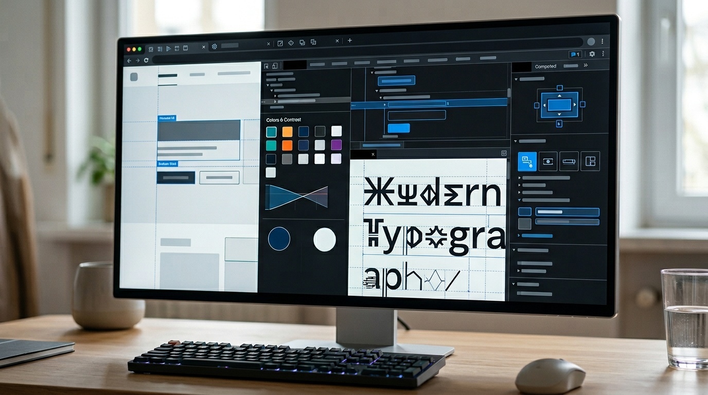
Modern browser developer tools can show the computed accessibility tree. In Chrome, Edge, Firefox, and Safari, inspect the element and look for accessibility information such as role, name, and description. You are checking three things:
- Is the role what you expect?
- Is the accessible name clear and specific?
- Is the description helpful without replacing the name?
Then test a few flows with a real screen reader. You do not need to become a full-time assistive technology expert to catch the basics. On macOS, VoiceOver is built in. On Windows, NVDA is widely used and free. On mobile, test with VoiceOver on iOS and TalkBack on Android where relevant.
Automated tools are useful, but they cannot reliably tell whether “Open,” “Read more,” or “Delete” is sufficiently contextual. Treat automation as a net, not a judge. This is similar to performance auditing: a report can point you to suspicious areas, but you still need to interpret impact. The same calm approach we recommend for reading a Lighthouse report without panicking applies here.
A practical review checklist
Before shipping ARIA labels, ask:
- Could this be native HTML instead?
- Is there visible text that should be used as the label?
- If visible text exists, does the accessible name include it?
- Are repeated controls unique when navigated out of visual context?
- Is help text connected with
aria-describedby, not forced into the label? - Are decorative icons hidden from assistive technology?
- Has someone checked the computed accessibility name in browser dev tools?
- Has at least one real screen reader pass been done for the critical flow?
This checklist catches most label problems before they become user problems.
The quiet discipline of good ARIA
Good ARIA work is rarely dramatic. It is mostly restraint.
Use real buttons. Use real labels. Keep visible and accessible names aligned. Add aria-label only when there is no better visible source. Use aria-labelledby when the page already contains the right text. Use aria-describedby for supporting instructions and errors.
The web platform gives developers a lot for free when we use it directly. ARIA is there for the gaps. The skill is knowing when there is actually a gap.
Frequently asked questions
Should every button have an aria-label?
What is the difference between aria-label and aria-labelledby?
Can aria-label fix a div used as a button?
Should aria-label match the visible text exactly?
How do I know what a screen reader will announce?
Sources & further reading