A short, opinionated checklist for accessible web buttons
Five rules that catch most button accessibility problems before they reach production
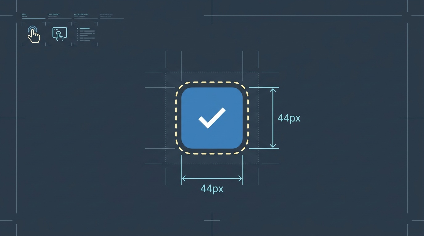
Table of contents
- The problem with button accessibility advice
- 1. Use the button element for buttons
- 2. Make the hit target at least 44×44 pixels
- 3. Provide visible focus states that aren't just browser defaults
- 4. Write button labels that make sense out of context
- 5. Ensure sufficient color contrast
- What this checklist doesn't cover
- How to integrate this into your workflow
- The cost of skipping this work
- Key takeaways
- FAQ
- Sources
The problem with button accessibility advice
Most button accessibility guidance falls into two camps: either it's a 40-page WCAG interpretation that nobody reads, or it's a vague suggestion to "make buttons accessible" with no actionable steps. Neither helps when you're shipping a feature on Thursday.
This checklist covers the five most common button accessibility failures we see in production. It won't make you a WCAG expert, but it will catch the problems that actually affect users.
1. Use the button element for buttons
If it acts like a button, it should be a <button> element. Not a <div> with onclick, not a <span> with role="button", not an <a> with href="#" and preventDefault.
The <button> element gives you keyboard navigation, focus management, and screen reader announcements for free. When you use a <div>, you're rebuilding all of that from scratch — and you will get it wrong.
The only exception: if the action navigates to a new page or changes the URL, use an <a> element. Links and buttons are semantically different. Screen reader users navigate by element type, and they expect buttons to perform actions and links to navigate.
2. Make the hit target at least 44×44 pixels
WCAG 2.5.5 (Level AAA) requires interactive elements to have a minimum target size of 44×44 CSS pixels. This isn't about visual size — it's about the clickable area.
You can have a small visual button with adequate padding, or you can extend the hit target with a pseudo-element. What matters is that the user doesn't have to aim precisely.
Mobile users, people with motor impairments, and anyone using a device in motion will miss small targets. A 24×24 pixel icon button might look clean, but it's a usability failure.
3. Provide visible focus states that aren't just browser defaults
The browser default focus ring is better than nothing, but it's inconsistent across browsers and often invisible against certain backgrounds. You need a custom focus state that works in your design system.
A good focus indicator has three qualities:
- High contrast: at least 3:1 against adjacent colors
- Visible offset: not hidden by the button's own border or background
- Consistent shape: users should recognize it as a focus indicator across your interface
Don't remove outline: none without replacing it with something better. And don't make focus states so subtle that only you can see them in perfect lighting conditions.
4. Write button labels that make sense out of context
Screen reader users often navigate by jumping between buttons. When they do, they hear a list of button labels with no surrounding context.
A button labeled "Learn more" is useless in that list. So is "Click here" or "Submit". The label should describe the action: "Download the accessibility checklist", "Subscribe to updates", "Delete this comment".
If your design requires a short visual label, use aria-label to provide a descriptive alternative. But the better solution is to write labels that work for everyone.
For icon-only buttons, aria-label is mandatory. A button with just a magnifying glass icon needs aria-label="Search" or equivalent text. The icon is not accessible to screen readers.
5. Ensure sufficient color contrast

WCAG 2.1 requires a contrast ratio of at least 4.5:1 for normal text and 3:1 for large text (18pt or 14pt bold). Button labels are usually normal text.
Light gray text on a white button fails. Pale blue on a light blue background fails. These combinations might look sophisticated, but they exclude users with low vision, color blindness, or anyone viewing the screen in bright sunlight.
Use a contrast checker during design, not after launch. Fixing contrast issues in production is expensive because it often requires design system changes.
If you're working with image processing tools, client-side processing can help preserve privacy while generating accessible visual assets — particularly when testing color combinations or generating preview states.
What this checklist doesn't cover
This list is deliberately incomplete. It doesn't cover disabled state semantics, loading states, error handling, or complex button patterns like split buttons or dropdown triggers. Those patterns need their own guidance.
It also doesn't cover the broader question of when to use a button versus other interactive elements. For that, you need to understand semantic HTML and the accessibility tree — topics that deserve their own articles.
What it does cover is the low-hanging fruit: the mistakes that show up in almost every code review, that affect the most users, and that are easiest to fix during development.
How to integrate this into your workflow
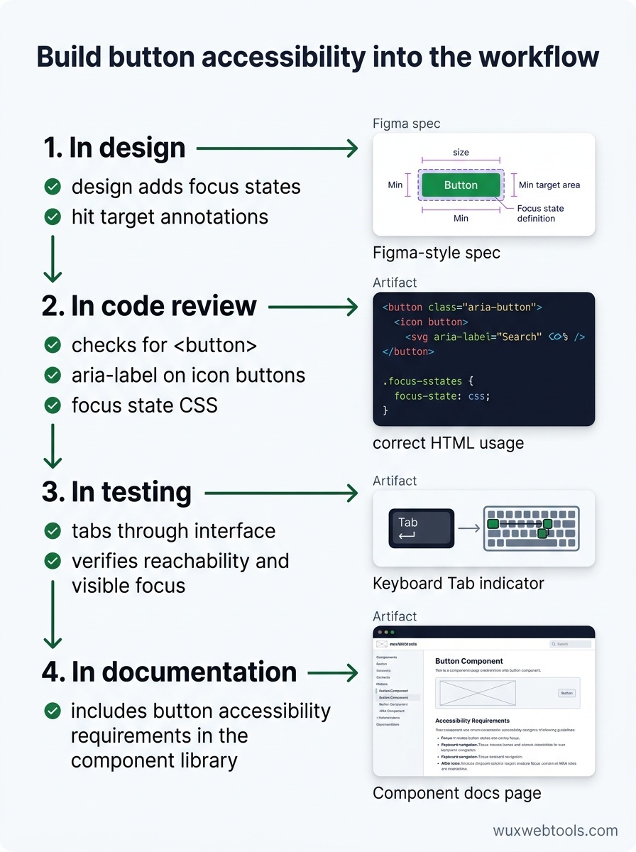
Accessibility checklists only work if they're part of the development process, not bolted on afterward. Here's how to make that happen:
In design: add focus states and hit target annotations to your design files. Don't leave these for developers to guess.
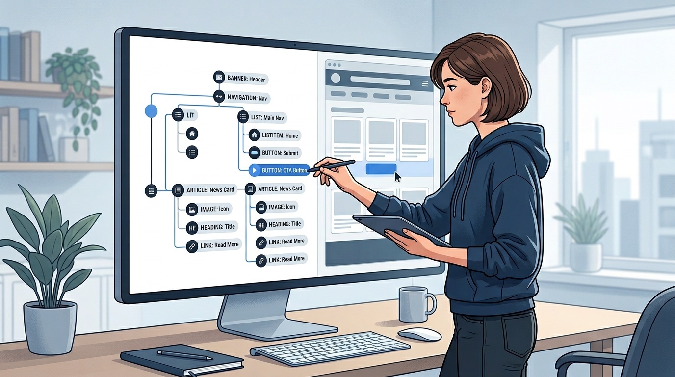
In code review: check for <button> elements, aria-label on icon buttons, and focus state CSS. These are quick to spot.
In testing: tab through your interface with the keyboard. If you can't reach a button or can't see where focus is, neither can your users.
In documentation: include button accessibility requirements in your component library. Make it easier to do the right thing than to do the wrong thing.
If you're debugging production issues, tools for inspecting HTTP headers and redirects can help you understand how assistive technologies are interpreting your markup — particularly when troubleshooting focus management after navigation.
The cost of skipping this work
Inaccessible buttons don't just fail WCAG compliance — they break workflows. A user who can't click a submit button can't complete a form. A user who can't see focus states can't navigate with a keyboard. A user who can't distinguish button text from the background can't read the label.
These aren't edge cases. Roughly 15% of the global population has some form of disability, and temporary impairments (broken mouse, bright sunlight, holding a baby) affect everyone eventually.
The good news is that button accessibility is mostly solved problems. You don't need to invent new patterns or wait for browser support. You just need to use the platform correctly and test your work.
Key takeaways
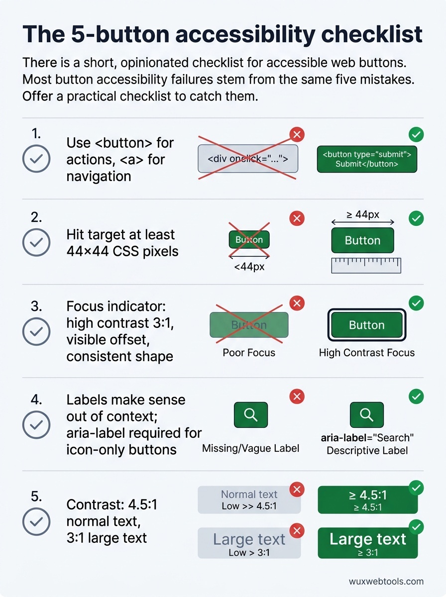
- Use
<button>elements for buttons and<a>elements for navigation — the semantic difference matters for assistive technology - Ensure hit targets are at least 44×44 CSS pixels to accommodate motor impairments and mobile users
- Provide visible, high-contrast focus states that work across your design system
- Write button labels that make sense when read in isolation, and use
aria-labelfor icon-only buttons - Check color contrast during design, not after launch, to avoid expensive retrofits
FAQ
Q: Can I use role="button" on a <div> if I add keyboard handlers?
A: You can, but you shouldn't. You'll need to handle Enter, Space, focus management, and disabled states manually — and you'll inevitably miss something. The <button> element does all of this correctly by default. Use it.
Q: What about buttons that toggle state, like a play/pause button?
A: Use aria-pressed="true" or aria-pressed="false" to indicate the current state. The button label should also reflect the action that will happen on click ("Pause" when playing, "Play" when paused), not the current state. Screen reader users need to know what the button will do, not what state the system is in.
Q: Do disabled buttons need to meet contrast requirements?
A: WCAG 2.1 exempts disabled controls from contrast requirements (1.4.3), but this is controversial. Disabled buttons with poor contrast are hard for everyone to perceive. If you're going to show a disabled button, make it readable. Better yet, hide it or explain why it's disabled.
Q: How do I test button accessibility without a screen reader?
A: Use your keyboard. Tab through the interface and verify that you can reach every button, see where focus is, and activate buttons with Enter or Space. This catches most problems. For deeper testing, use the accessibility inspector in Chrome or Firefox DevTools to check the computed role and label.
Q: What's the difference between aria-label and aria-labelledby?
A: aria-label provides a text string directly. aria-labelledby references the ID of another element whose text content becomes the label. Use aria-labelledby when the label text already exists elsewhere in the DOM. Use aria-label when you need to provide a label that isn't visible on screen.
Sources
- Web Content Accessibility Guidelines (WCAG) 2.1 — W3C
- Inclusive Components: Toggle Buttons — Heydon Pickering
- The ARIA Button Pattern — W3C ARIA Authoring Practices Guide
- WebAIM: Keyboard Accessibility — WebAIM