ARIA labels के लिए developer guide जो सच में मदद करते हैं
ARIA labels कोई जादुई accessibility layer नहीं हैं। सही तरह से इस्तेमाल करने पर वे controls को समझने योग्य बनाते हैं। लापरवाही से इस्तेमाल करने पर वे उपयोगी text छिपा देते हैं और भ्रमित करने वाले interfaces बनाते हैं।

सामग्री की तालिका
- ARIA labels नामों के लिए हैं, माफ़ीनामों के लिए नहीं
- Accessible name, सरल भाषा में
- पहला नियम: native HTML और visible labels को प्राथमिकता दें
- कब `aria-label` सही tool है
- कब `aria-label` गलत tool है
- जब visible text पहले से मौजूद हो, तो `aria-labelledby` चुनें
- Help text के लिए `aria-describedby` का उपयोग करें, name के लिए नहीं
- Repeated controls को unique names चाहिए
- हर चीज़ को label न करें
- केवल code नहीं, computed name भी check करें
- एक practical review checklist
- अच्छे ARIA का शांत अनुशासन
ARIA labels नामों के लिए हैं, माफ़ीनामों के लिए नहीं
ARIA उपयोगी है, लेकिन अक्सर इसे अस्पष्ट HTML के patch के रूप में इस्तेमाल किया जाता है। यहीं teams परेशानी में पड़ती हैं।
सबसे आम उदाहरण aria-label है। यह नुकसानरहित दिखता है: एक string जोड़ें, linter को संतुष्ट करें, और आगे बढ़ जाएँ। लेकिन accessible name सजावट नहीं है। यह वह नाम है जिसे कई assistive technologies users को दिखाती या सुनाती हैं जब वे buttons, links, form fields, headings, landmarks, और controls के आधार पर navigate करते हैं।
अगर वह नाम अस्पष्ट, duplicate, पुराना, या visible label से अलग है, तो interface का उपयोग कठिन हो जाता है। कभी-कभी इससे भी खराब: aria-label उस बेहतर text को override कर सकता है जो DOM में पहले से मौजूद था।
लक्ष्य अधिक ARIA जोड़ना नहीं है। लक्ष्य हर interface element का name, role, state, और purpose स्पष्ट करना है।
Accessible name, सरल भाषा में
अधिकतर interactive elements का एक accessible name होता है। Screen readers उसी नाम का उपयोग करके बताते हैं कि element क्या है।
उदाहरण के लिए:
<button>Save changes</button>एक screen reader कुछ इस तरह announce कर सकता है: “Save changes, button.” Role native button element से आता है। Name उसके अंदर के text से आता है।
यह आदर्श स्थिति है: visible text और accessible name मेल खाते हैं।
ARIA labeling attributes तब उपयोगी होते हैं जब visible interface पूरा name नहीं देता, या जब name किसी दूसरे element से आना चाहिए। मुख्य attributes हैं:
aria-label: element पर सीधे एक string देता है।aria-labelledby: एक या अधिक elements की ओर point करता है जिनका text name बनता है।aria-describedby: supporting description text की ओर point करता है, मुख्य name की ओर नहीं।
ये तीनों संबंधित हैं, लेकिन एक-दूसरे के विकल्प नहीं हैं।
पहला नियम: native HTML और visible labels को प्राथमिकता दें
अगर आप control पर visible text रख सकते हैं, तो पहले वही करें।
यह बेहतर है:
<button>Delete invoice</button>इससे:
<button aria-label="Delete invoice">
  <svg aria-hidden="true" focusable="false">...</svg>
</button>
दूसरा pattern icon-only button के लिए valid है। लेकिन अगर design visible text स्वीकार कर सकता है, तो visible text सभी की मदद करता है: screen reader users, speech recognition users, cognitive load वाले लोग, जल्दी scan करने वाले लोग, और translation tools इस्तेमाल करने वाले लोग।
Accessibility work में यह बार-बार आने वाला theme है। Native HTML और visible affordances hidden metadata की तुलना में ज़्यादा समस्याएँ हल करते हैं। यही सिद्धांत button semantics पर व्यापक रूप से लागू होता है; अगर आपकी team UI controls audit कर रही है, तो हमारी accessible web buttons के लिए checklist इस guide की अच्छी companion है।
कब aria-label सही tool है
aria-label का उपयोग तब करें जब किसी element को accessible name चाहिए और reference करने के लिए कोई उपयुक्त visible text न हो।
Classic case icon-only button है:
<button aria-label="Search">
  <svg aria-hidden="true" focusable="false" viewBox="0 0 24 24">
    <!-- icon -->
  </svg>
</button>
यह उचित है। Visible icon search का संकेत देता है, लेकिन SVG path खुद reliable name नहीं देता। aria-label वह name उपलब्ध कराता है।
अन्य अच्छे cases में शामिल हैं:
- एक close button जो केवल “X” से दिखाया गया हो।
- एक navigation landmark जिसे अधिक specific name चाहिए, जैसे
aria-label="Product"। - एक repeated control जहाँ visible context button text का हिस्सा नहीं है।
उदाहरण के लिए:
<nav aria-label="Primary">
  ...
</nav>

<nav aria-label="Footer">
  ...
</nav>
दोनों navigation landmarks हैं, लेकिन उनके labels users को landmarks के आधार पर move करते समय उन्हें अलग पहचानने में मदद करते हैं।
कब aria-label गलत tool है
सिर्फ इसलिए aria-label न जोड़ें कि कोई test कहता है कि element को label चाहिए। पहले markup ठीक करें।
खराब:
<div role="button" tabindex="0" aria-label="Submit">Submit</div>बेहतर:
<button>Submit</button>पहला उदाहरण अनावश्यक काम पैदा करता है। अब आपको keyboard behavior, disabled states, form behavior, और वे expectations फिर से बनानी पड़ेंगी जो native buttons पहले से देते हैं।
Visible text को ऐसे rename करने के लिए भी aria-label का उपयोग न करें जिससे meaning बदल जाए।
<button aria-label="Delete invoice">Remove</button>यह छोटा बदलाव लगता है, लेकिन speech input पर निर्भर users को भ्रमित कर सकता है। अगर visible button “Remove” कहता है, लेकिन उसका accessible name “Delete invoice” है, तो “click Remove” कहने की कोशिश करने वाले user को अपेक्षित result नहीं मिल सकता। WCAG की “label in name” requirement ठीक इसी कारण मौजूद है: visible text आम तौर पर accessible name में शामिल होना चाहिए।
एक बेहतर version:
<button aria-label="Remove invoice">Remove</button>अक्सर इससे भी बेहतर:
<button>Remove invoice</button>जब visible text पहले से मौजूद हो, तो aria-labelledby चुनें
अगर label text page पर पहले से मौजूद है, तो aria-labelledby आम तौर पर aria-label से बेहतर होता है।
Example:
<h2 id="billing-title">Billing address</h2>
<section aria-labelledby="billing-title">
  ...
</section>
Section का accessible name अब visible heading से आता है। आप strings duplicate करने से बचते हैं, जिससे translation mistakes और पुराने labels कम होते हैं।
यह form groups के लिए विशेष रूप से उपयोगी है:
<fieldset aria-labelledby="shipping-speed-title">
  <legend id="shipping-speed-title">Shipping speed</legend>

  <label>
    <input type="radio" name="shipping" value="standard">
    Standard
  </label>

  <label>
    <input type="radio" name="shipping" value="express">
    Express
  </label>
</fieldset>
कई cases में native legend ARIA के बिना ही पर्याप्त होता है। बात यह है कि visible labels को lead करना चाहिए। ARIA को existing meaning connect करना चाहिए, उसका दूसरा private version नहीं बनाना चाहिए।
Help text के लिए aria-describedby का उपयोग करें, name के लिए नहीं
Description label नहीं है।
इस field पर विचार करें:
<label for="password">Password</label>
<input id="password" type="password" aria-describedby="password-help">
<p id="password-help">Use at least 12 characters.</p>
Accessible name “Password” है। Description “Use at least 12 characters.” है। Screen reader दोनों announce कर सकता है, लेकिन उनके purpose अलग हैं।
ऐसा न करें:
<input type="password" aria-label="Use at least 12 characters">यह field का name instruction पर रख देता है, concept पर नहीं। Form navigate करने वाला user पहले जानना चाहता है कि field क्या है, फिर कौन-सी constraints लागू हैं।
Error states में भी यह अंतर महत्वपूर्ण है:
<label for="email">Email</label>
<input
  id="email"
  type="email"
  aria-invalid="true"
  aria-describedby="email-error"
>
<p id="email-error">Enter an email address in the format [email protected].</p>
Label stable रहता है। Error message supporting context बन जाता है।
Repeated controls को unique names चाहिए
Lists और cards वे जगहें हैं जहाँ ARIA labels अक्सर ज़रूरी हो जाते हैं।
खराब:
<button>Delete</button>
<button>Delete</button>
<button>Delete</button>
Buttons के आधार पर navigate करने वाला screen reader user “Delete, button” तीन बार सुन सकता है, बिना किसी context के।
अच्छा:
<button aria-label="Delete report: Q4 revenue">Delete</button>
<button aria-label="Delete report: Hiring plan">Delete</button>
<button aria-label="Delete report: Vendor list">Delete</button>
यह aria-label का legitimate use है: visible text concise रहता है, जबकि accessible name में object शामिल होता है।
लेकिन इस pattern का उपयोग सावधानी से करें। अगर object name पास में visible है, तो aria-labelledby अधिक maintainable हो सकता है:
<article>
  <h3 id="report-q4">Q4 revenue</h3>
  <button aria-labelledby="delete-q4 report-q4" id="delete-q4">Delete</button>
</article>
Accessible name “Delete Q4 revenue” बनता है। इससे attribute में report title duplicate करने से बचाव होता है।
हर चीज़ को label न करें
हर element को ARIA label की ज़रूरत नहीं होती।
Static text को आम तौर पर नहीं। Decorative icons को नहीं। Containers को नहीं, जब तक उनके पास meaningful landmark या widget role न हो। Over-labeling page को noisy और navigate करने में कठिन बना सकता है।
Images के लिए image-specific model इस्तेमाल करें: meaningful images को उपयोगी alt चाहिए; decorative images को empty alt="" चाहिए। अच्छे image text के substitute के रूप में ARIA labels का उपयोग न करें। अगर आपकी team इन concepts को मिला रही है, तो pragmatic image alt text दोबारा देखें और image alternatives को control names से अलग रखें।
एक आम गलती हर SVG को aria-label देना है। अगर SVG किसी button के अंदर है और button का name पहले से है, तो icon को आम तौर पर assistive tech से hidden होना चाहिए:
<button aria-label="Open menu">
  <svg aria-hidden="true" focusable="false">...</svg>
</button>
अन्यथा, browser और assistive technology combination के आधार पर user redundant या अजीब announcements सुन सकता है।
केवल code नहीं, computed name भी check करें
Accessibility bugs अक्सर code review से बच जाते हैं क्योंकि markup देखने में plausible लगता है।
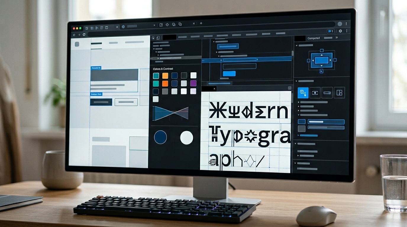
Modern browser developer tools computed accessibility tree दिखा सकते हैं। Chrome, Edge, Firefox, और Safari में element inspect करें और role, name, और description जैसी accessibility information देखें। आप तीन चीज़ें check कर रहे हैं:
- क्या role वही है जिसकी आप अपेक्षा करते हैं?
- क्या accessible name clear और specific है?
- क्या description name को replace किए बिना helpful है?
फिर real screen reader के साथ कुछ flows test करें। Basics पकड़ने के लिए आपको full-time assistive technology expert बनने की ज़रूरत नहीं है। macOS पर VoiceOver built in है। Windows पर NVDA व्यापक रूप से इस्तेमाल होता है और free है। Mobile पर, जहाँ relevant हो, iOS पर VoiceOver और Android पर TalkBack के साथ test करें।
Automated tools उपयोगी हैं, लेकिन वे reliably नहीं बता सकते कि “Open,” “Read more,” या “Delete” पर्याप्त context रखते हैं या नहीं। Automation को net की तरह मानें, judge की तरह नहीं। यह performance auditing जैसा है: report आपको suspicious areas दिखा सकती है, लेकिन impact interpret करना फिर भी आपको ही होता है। Lighthouse report को बिना घबराए पढ़ने के लिए हम जो calm approach recommend करते हैं, वही यहाँ भी लागू होती है।
एक practical review checklist
ARIA labels ship करने से पहले पूछें:
- क्या यह इसके बजाय native HTML हो सकता है?
- क्या कोई visible text है जिसे label के रूप में इस्तेमाल किया जाना चाहिए?
- अगर visible text मौजूद है, तो क्या accessible name उसे शामिल करता है?
- क्या repeated controls visual context से बाहर navigate किए जाने पर unique हैं?
- क्या help text
aria-describedbyसे connected है, label में force नहीं किया गया है? - क्या decorative icons assistive technology से hidden हैं?
- क्या किसी ने browser dev tools में computed accessibility name check किया है?
- क्या critical flow के लिए कम से कम एक real screen reader pass किया गया है?
यह checklist ज़्यादातर label problems को user problems बनने से पहले पकड़ लेती है।
अच्छे ARIA का शांत अनुशासन
अच्छा ARIA work शायद ही कभी dramatic होता है। यह ज़्यादातर restraint है।
Real buttons इस्तेमाल करें। Real labels इस्तेमाल करें। Visible और accessible names को aligned रखें। aria-label केवल तब जोड़ें जब कोई बेहतर visible source न हो। जब page में पहले से सही text मौजूद हो, तो aria-labelledby इस्तेमाल करें। Supporting instructions और errors के लिए aria-describedby इस्तेमाल करें।
जब हम web platform को सीधे इस्तेमाल करते हैं, तो वह developers को बहुत कुछ free में देता है। ARIA gaps के लिए है। Skill यह जानने में है कि gap वास्तव में कब है।
अक्सर पूछे जाने वाले प्रश्न
क्या हर button में aria-label होना चाहिए?
aria-label और aria-labelledby में क्या अंतर है?
क्या aria-label button के रूप में इस्तेमाल किए गए div को ठीक कर सकता है?
क्या aria-label visible text से exactly match करना चाहिए?
मुझे कैसे पता चलेगा कि screen reader क्या announce करेगा?
स्रोत और आगे की पढ़ाई