Web fonts are still the easiest performance win on most sites
Five years after variable fonts shipped and ten years after WOFF2 became universal, the average site is still loading fonts wrong. Here is the short version of how to get it right.
 The Wux Webtools Team
4 min read
The Wux Webtools Team
4 min read

Table of contents
The pattern that keeps appearing
If you audit a random ten production websites today, you will find roughly the same font situation on most of them:
- Six to ten font files loaded on the home page
- All of them in WOFF2 (good) but with no
font-displaystrategy (bad) - Several weights and styles that are not used anywhere on the page
- The whole stack served from a third-party domain (Google Fonts, usually) with all the DNS, TLS and privacy cost that entails
- No
unicode-rangesubsetting, so every visitor downloads the Cyrillic and Greek glyphs even if the page is in English
This is not a problem unique to small sites. Plenty of well-funded marketing pages still load 600 KB of fonts before the first paragraph is paintable. Once you start noticing the pattern, you cannot unsee it.
The fix is not exotic. It is a handful of well-understood techniques that have been in browsers for years.
Use one variable font instead of six static ones
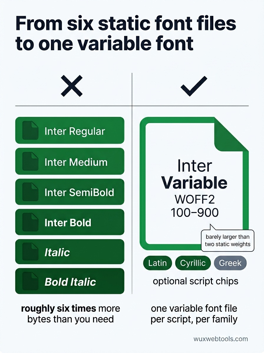
If you are loading Inter Regular, Inter Medium, Inter SemiBold, Inter Bold and their italics, you are downloading roughly six times more bytes than you need. A single Inter variable font covers the entire weight axis (and slant, in some builds) in one file that is barely larger than two static weights.
The browser support story has been settled for years — variable fonts work everywhere that matters. The remaining hesitation is mostly inherited muscle memory from the static-font era.
A practical rule of thumb: one variable font file per script, per family. Latin in one file, Cyrillic in another, Greek in a third, loaded conditionally with unicode-range. That is it.
Set a sensible font-display
The default behaviour when a custom font is still loading is to show nothing — invisible text — for up to three seconds. This is the worst possible default. Users see a blank page and assume something is broken.
Add this to every @font-face rule:
@font-face {
  font-family: 'Inter';
  src: url('/fonts/inter-var.woff2') format('woff2-variations');
  font-weight: 100 900;
  font-display: swap;
}
swap shows the fallback font immediately and swaps in the custom font when it loads. The user can read the page from millisecond zero. The trade-off is a brief layout shift when the swap happens, which you mitigate with the next technique.
Match your fallback metrics
A flash of unstyled text only feels jarring when the fallback and the custom font have very different metrics. Modern CSS fixes this with size-adjust, ascent-override and friends:
@font-face {
  font-family: 'Inter Fallback';
  src: local('Arial');
  size-adjust: 107%;
  ascent-override: 90%;
  descent-override: 22%;
  line-gap-override: 0%;
}
With fallback metrics tuned, the swap is barely perceptible — words occupy the same horizontal space before and after the custom font arrives.
Google's --allow-fallback-font-metrics work is now baseline browser support, and there is a tooling pipeline (the fontaine library and similar) that calculates the right numbers for you in seconds.
Self-host
Google Fonts is convenient, free, and brings two genuine costs:
- A second TLS handshake. Even with HTTP/3 and connection coalescing, an extra origin is rarely free.
- A privacy and compliance question. Several European courts have ruled that loading Google Fonts from
fonts.gstatic.comconstitutes transmitting personal data (the IP address) to a third party. Self-hosting removes the question entirely.
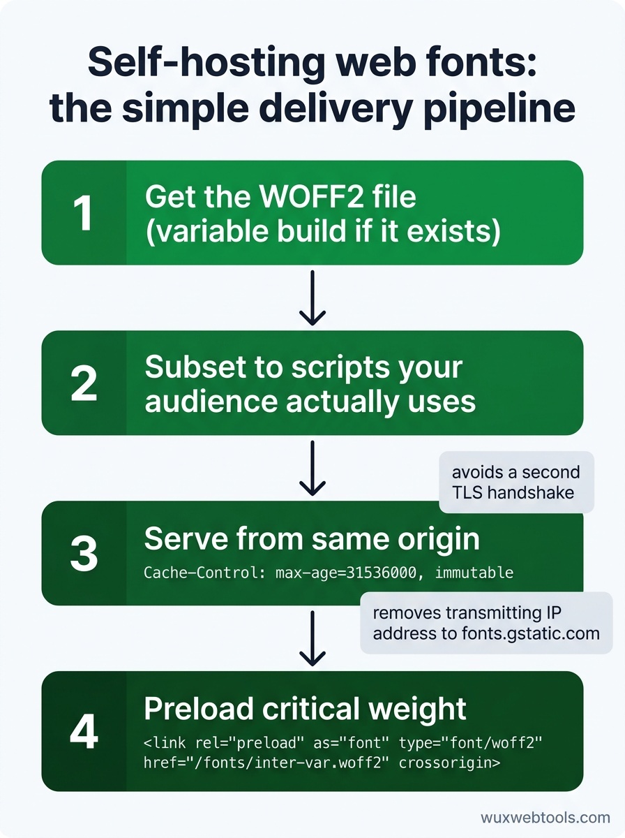
The download-and-host pipeline is:
- Get the WOFF2 file (variable build if it exists)
- Subset it to the scripts your audience actually uses
- Serve it from the same origin as the rest of your site, with a long
Cache-Control: max-age=31536000, immutable - Preload the most critical weight:
<link rel="preload" as="font" type="font/woff2" href="/fonts/inter-var.woff2" crossorigin>
That is the whole pipeline. It takes an afternoon for an existing site, and you almost never go back.
When to skip custom fonts entirely
It is worth saying out loud: not every site needs a custom font. The system font stack is now genuinely beautiful on every operating system:
font-family: system-ui, -apple-system, 'Segoe UI', Roboto, Inter, sans-serif;The weight is right, the metrics are right, the rendering is tuned for the device, and the bytes-on-the-wire cost is exactly zero. For a tools site, an internal app, a portfolio that prioritises content, or anything aimed at users on slow networks, the system stack is the correct answer.
<!-- tool-cta:start -->
💡 Try this: Convert your TTF or OTF files to modern WOFF2 with ready-to-use CSS using the Webfont Generator, which is the format swap the post recommends.
<!-- tool-cta:end -->
The honest summary
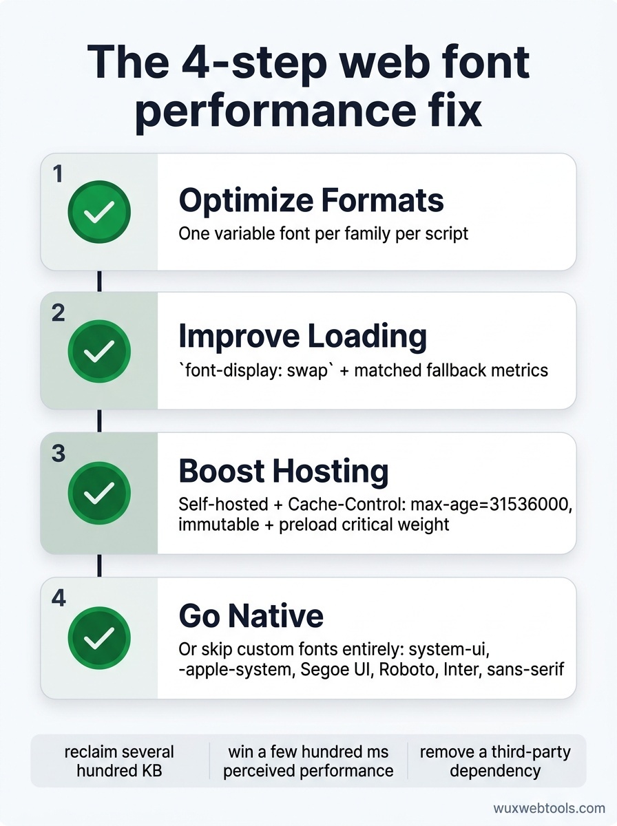
For a typical small site, four steps cover the entire web-font performance story:
- One variable font per family per script
font-display: swapwith matched fallback metrics- Self-hosted with long cache headers and a
preloadfor the critical weight - Or skip fonts entirely and use the system stack
Do this once and you reclaim several hundred kilobytes from the home page, win a few hundred milliseconds of perceived performance, and remove a third-party dependency on the way. Few changes have a better effort-to-payoff ratio.
Frequently asked questions
Are variable fonts supported everywhere?
Should I subset my fonts manually?
Why does font-display: swap sometimes cause an ugly flash?
Is Google Fonts really a privacy issue?
Sources & further reading