A practical guide to readable type on the modern web
Most websites are harder to read than they need to be. Here's how to fix the basics without becoming a typography expert.

Table of contents
- Why most websites are harder to read than they should be
- Font size: bigger than you think
- Line height: give text room to breathe
- Line length: shorter than you think
- Contrast: not as simple as black on white
- Typeface choice: default fonts are better than you think
- Responsive typography: fluid type scales
- Paragraph spacing and text alignment
- Testing readability in practice
- What this looks like in practice
- When to break the rules
Why most websites are harder to read than they should be
The average website in 2026 ships with a custom font family, carefully chosen brand colors, and a design system that specifies spacing down to the pixel. Yet the body text—the thing most visitors actually came to read—often sits at 14px in a low-contrast gray, set in a typeface optimized for headlines, not paragraphs.
This isn't a rant about designers. It's a reminder that readability is a distinct discipline from visual design, and the two don't always align. A typeface that looks sharp in a hero section can be exhausting at paragraph length. A color palette that photographs well can fail contrast checks. A layout that works on a 27-inch monitor can collapse into a narrow column on mobile.
The good news: readable type doesn't require a typography degree. It requires attention to a handful of variables that have disproportionate impact.
Font size: bigger than you think
The most common readability mistake on the web is body text that's too small. Designers often set body copy at 14px or 15px because it "looks clean" at desktop scale, then forget that a significant portion of readers are on phones, often in less-than-ideal lighting.
A practical baseline for body text in 2026:
- Desktop: 18px minimum, 20px preferred
- Mobile: 16px minimum, 18px preferred
These numbers feel large if you're used to smaller type, but they reflect how people actually read on screens. Larger text reduces eye strain, improves comprehension, and makes your content accessible to readers with mild vision impairment who haven't adjusted their browser settings.
If your design system mandates smaller type, test it on a phone in sunlight. If you squint, it's too small.
Line height: give text room to breathe
Line height (leading) is the vertical space between lines of text. Too tight, and lines blur together. Too loose, and the eye loses the thread between lines.
For body text, a line height of 1.5 to 1.7 works for most typefaces. Headlines can go tighter (1.1 to 1.3), but body copy needs breathing room.
The CSS:
body {
  font-size: 18px;
  line-height: 1.6;
}
This is one of the easiest readability wins. If your body text currently sits at line-height: 1.2 or uses a fixed pixel value, change it today.
Line length: shorter than you think
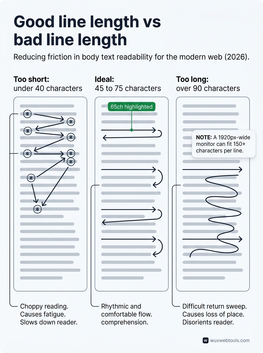
The optimal line length for body text is 45 to 75 characters per line, roughly 8 to 12 words. Lines longer than 90 characters make it hard for the eye to track back to the start of the next line. Lines shorter than 40 characters create a choppy, fragmented reading experience.
Most websites get this wrong by letting text span the full width of the viewport, especially on desktop. A 1920px-wide monitor can fit 150+ characters per line, which is exhausting to read.
The fix is a max-width on your text container:
.prose {
  max-width: 65ch; /* 65 characters */
  margin-inline: auto;
}
The ch unit is underused but perfect for this: it scales with font size and roughly corresponds to character width.
Contrast: not as simple as black on white
WCAG 2.1 specifies a minimum contrast ratio of 4.5:1 for body text (AA level) and 7:1 for enhanced accessibility (AAA level). Most websites meet this on paper but fail in practice because they use light gray text on white backgrounds.
Common offenders:
#666666on#FFFFFF(4.54:1, barely passes)#777777on#FFFFFF(4.47:1, fails)- Any shade lighter than
#767676on white (fails)
If your design system specifies "text-secondary" as a light gray, test it. The WebAIM contrast checker is the fastest way to verify.
Dark mode complicates this further. Pure white text on pure black creates halation (a glowing effect) that's harder to read than slightly off-white on dark gray. A better approach:
@media (prefers-color-scheme: dark) {
  body {
    background: #1a1a1a;
    color: #e4e4e4;
  }
}
Typeface choice: default fonts are better than you think
Custom web fonts are ubiquitous, but they come with trade-offs. They add latency, increase page weight, and can block rendering if not loaded carefully. For body text, system fonts are often the better choice.
A robust system font stack in 2026:
body {
  font-family: system-ui, -apple-system, 'Segoe UI',
               Roboto, Helvetica, Arial, sans-serif;
}
This gives you San Francisco on macOS/iOS, Segoe UI on Windows, and Roboto on Android—all highly readable, professionally designed typefaces that load instantly.
If you do use a custom font for body text, choose one designed for long-form reading, not display. Avoid:
- Ultra-light or ultra-bold weights for body copy
- Condensed or extended variants
- Fonts with low x-height (the height of lowercase letters)
Test your chosen typeface at paragraph length before committing.
Responsive typography: fluid type scales
Fixed font sizes don't scale well across devices. A 20px body font that's comfortable on desktop can feel oversized on mobile.
Fluid typography uses clamp() to scale font size smoothly between a minimum and maximum:
body {
  font-size: clamp(1rem, 0.9rem + 0.5vw, 1.25rem);
}
This scales from 16px on small screens to 20px on large screens, with smooth interpolation in between. It's more sophisticated than media query breakpoints and adapts to any viewport width.
For a full type scale (headings, body, small text), tools like Utopia generate fluid scales based on your constraints.
Paragraph spacing and text alignment
Two small details that matter:
- Paragraph spacing: Add space between paragraphs (
margin-block-end: 1em) or use a first-line indent (text-indent: 1.5em), but not both. Most web content uses spacing.
- Text alignment: Left-aligned (or right-aligned for RTL languages) is almost always more readable than justified text, which creates uneven word spacing unless hyphenation is enabled. Center-aligned body text is hard to read and should be reserved for short passages.
Testing readability in practice
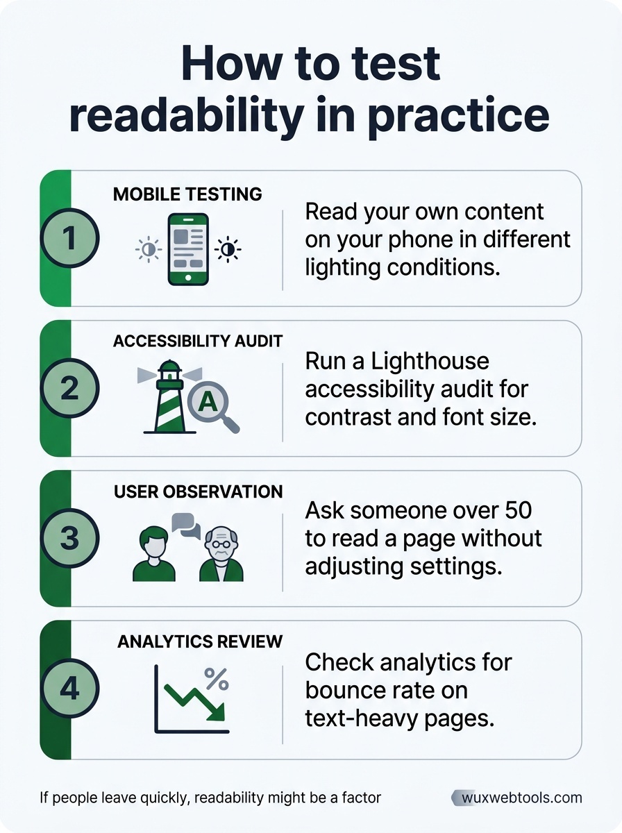
Readability isn't purely objective, but you can test it:
- Read your own content on your phone in different lighting conditions
- Run a Lighthouse accessibility audit to catch contrast and font size issues (see how to read a Lighthouse report for guidance)
- Ask someone over 50 to read a page without adjusting their settings
- Check your analytics for bounce rate on text-heavy pages—if people leave quickly, readability might be a factor
If your content is hard to read, people won't read it. It's that simple.
What this looks like in practice

A readable body text style in 2026 might look like:
.prose {
  font-family: system-ui, sans-serif;
  font-size: clamp(1.125rem, 1rem + 0.5vw, 1.25rem);
  line-height: 1.6;
  color: #1a1a1a;
  max-width: 65ch;
  margin-inline: auto;
}

.prose p {
  margin-block-end: 1.25em;
}

@media (prefers-color-scheme: dark) {
  .prose {
    background: #1a1a1a;
    color: #e4e4e4;
  }
}
This covers font size, line height, line length, contrast, and responsive scaling in about a dozen lines of CSS. It's not exciting, but it works.
When to break the rules
These guidelines apply to body text—the paragraphs people read for information. Headlines, captions, UI labels, and marketing copy have different constraints and can bend these rules.
But if someone came to your site to read an article, a documentation page, or a product description, readable type is not optional. It's the baseline expectation.
Frequently asked questions
Should I use a custom web font for body text?
What's the fastest way to check if my text is readable?
Does readable type hurt my design aesthetic?
How do I convince stakeholders that bigger text is better?
Sources & further reading