प्रोडक्शन में वेरिएबल फ़ॉन्ट्स: वे समझौते जिनके बारे में कोई नहीं बताता
वेरिएबल फ़ॉन्ट्स आपके फ़ॉन्ट स्टैक को सरल बना सकते हैं और डिज़ाइन लचीलेपन को बेहतर कर सकते हैं, लेकिन वे अपने-आप परफ़ॉर्मेंस जीत नहीं हैं।
सामग्री की तालिका
- वेरिएबल फ़ॉन्ट्स कोई जादुई फ़ॉन्ट compression नहीं हैं
- स्पष्ट लाभ: कम फ़ाइलें, अधिक अभिव्यंजक type
- पहला छिपा tradeoff: एक फ़ाइल उन फ़ाइलों से बड़ी हो सकती है जिनकी आपको वास्तव में ज़रूरत है
- Case A: कई weights वाली marketing site
- Case B: केवल regular और bold वाला product app
- दूसरा tradeoff: subsetting कम नहीं, अधिक महत्वपूर्ण हो जाती है
- तीसरा tradeoff: CSS बहुत अधिक clever हो सकता है
- चौथा tradeoff: rendering differences अब भी मौजूद हैं
- पाँचवाँ tradeoff: caching दोनों तरफ़ असर कर सकती है
- छठा tradeoff: Lighthouse पूरी कहानी नहीं समझाएगा
- एक व्यावहारिक production checklist
- 1. यह किन static files को replace कर रहा है?
- 2. आप कौन से axes expose करेंगे?
- 3. क्या आप सुरक्षित रूप से subset कर सकते हैं?
- 4. क्या fallback metrics configured हैं?
- 5. क्या `font-display` intentional है?
- 6. क्या आपने low-end devices test किए हैं?
- 7. क्या rollback plan है?
- कब variable fonts production के लिए अच्छा चुनाव हैं
- Production rule of thumb
वेरिएबल फ़ॉन्ट्स कोई जादुई फ़ॉन्ट compression नहीं हैं
वेरिएबल फ़ॉन्ट्स को अक्सर web typography के साफ़-सुथरे उत्तर के रूप में पेश किया जाता है: एक फ़ाइल, कई weights, कम requests, और अधिक सहज design systems. यह दावा दिशा में सही है, लेकिन अधूरा है।
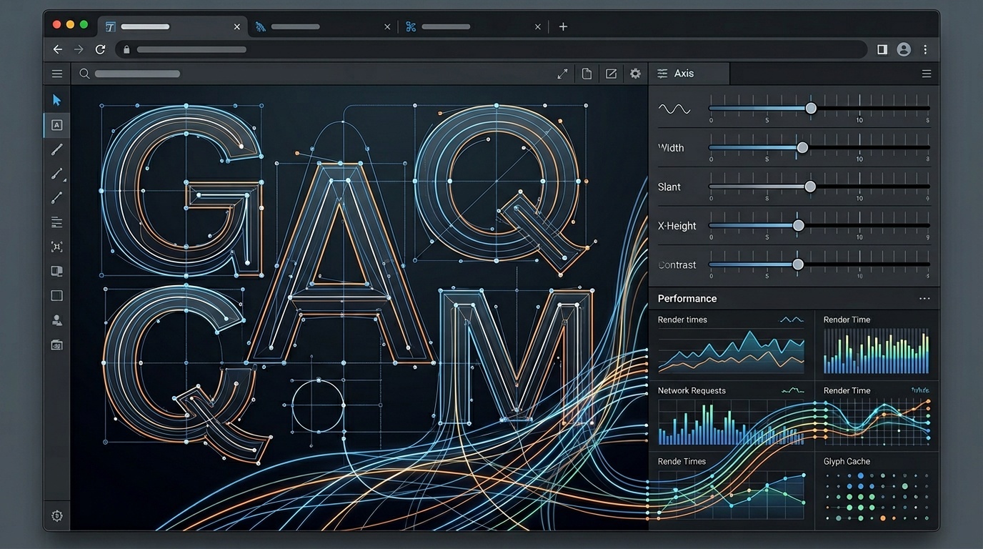
प्रोडक्शन में, एक वेरिएबल फ़ॉन्ट छह फ़ाइलों को एक फ़ाइल से बदलने जैसा कम और एक नया typography runtime अपनाने जैसा अधिक होता है। आपको weight, width, slant, optical size, और कभी-कभी custom axes पर अभिव्यंजक नियंत्रण मिलता है। साथ ही आप file size, browser rendering, fallback behavior, design governance, और performance measurement से जुड़े नए निर्णय भी अपने साथ ले आते हैं।
परिणाम उत्कृष्ट हो सकता है। यह उस static setup से भी खराब हो सकता है जिसे इसने बदला है।
यदि आपकी मौजूदा साइट एक ही family के पाँच weights भेजती है, तो अच्छी तरह subset किया गया variable font requests घटा सकता है और CSS को सरल बना सकता है। यदि आपकी साइट एक regular weight और एक bold weight भेजती है, तो variable font उस लचीलेपन के लिए bytes जोड़ सकता है जिसका किसी user को कभी लाभ नहीं मिलता। यही वह production tradeoff है जिसे लोग अक्सर छोड़ देते हैं।
Font loading strategy की व्यापक आधारभूमि के लिए, हमारी guide कि web fonts are still the easiest performance win on most sites उपयोगी साथी है। वेरिएबल फ़ॉन्ट्स मूल बातों को नहीं बदलते: कम bytes भेजें, render delay घटाएँ, और fallback text को स्वीकार्य बनाएँ।
स्पष्ट लाभ: कम फ़ाइलें, अधिक अभिव्यंजक type
एक पारंपरिक static font setup आम तौर पर ऐसा दिखता है:
- Regular 400
- Italic 400
- Medium 500
- Semibold 600
- Bold 700
- शायद एक अलग display face
हर फ़ाइल अलग से downloaded, cached, और rendered होती है। यदि page fold के ऊपर कई weights इस्तेमाल करता है, तो requests तेज़ी से बढ़ जाते हैं।
एक variable font इनमें से कई weights को एक फ़ाइल में समेट सकता है। Inter-Regular.woff2, Inter-Medium.woff2, और Inter-Bold.woff2 load करने के बजाय, आप एक variable file load करते हैं और continuous range में font-weight: 400 700 इस्तेमाल करते हैं।
इससे वास्तविक लाभ मिलते हैं:
- manage करने के लिए कम font files
- weights के बीच अधिक consistent interpolation
- fine-grained responsive typography
- आसान theme systems
- बेहतर design-token alignment
Design systems के लिए यह नियंत्रण विशेष रूप से उपयोगी है। Button label को 500 या 600 में मजबूर होने के बजाय 580 इस्तेमाल करने दिया जा सकता है। यदि font support करता है, तो narrow card title थोड़ा condensed width axis इस्तेमाल कर सकता है। Display headline उपलब्ध होने पर optical sizing इस्तेमाल कर सकता है।
लेकिन इन controls के मौजूद होने का मतलब यह नहीं कि आपको उन सभी का इस्तेमाल करना चाहिए।
पहला छिपा tradeoff: एक फ़ाइल उन फ़ाइलों से बड़ी हो सकती है जिनकी आपको वास्तव में ज़रूरत है
एक variable font में design space के लिए interpolation data होता है। उस design space की लागत होती है। एक single variable font file एक या दो static font files से बड़ी हो सकती है।
जब यह कई फ़ाइलों को बदलती है, तब यह समस्या नहीं है। जब यह एक संयमित stack को बदलती है, तब यह समस्या है।
दो सामान्य मामलों पर विचार करें:
Case A: कई weights वाली marketing site
साइट pages में 300, 400, 500, 600, 700, और italics इस्तेमाल करती है। सावधानी से subset किया गया variable font शायद मदद करेगा। यह request overhead घटाता है और future maintenance को सरल बनाता है।
Case B: केवल regular और bold वाला product app
Interface 400 और 700 इस्तेमाल करता है, fallback के रूप में system fonts के साथ। Variable font अनावश्यक bytes जोड़ सकता है। Figma में लचीलापन अच्छा लगता है, लेकिन browser में हमेशा उपयोगी नहीं होता।
गलती “एक variable file” की तुलना “कई theoretical static files” से करना है, बजाय इसके कि उसकी तुलना उन files से की जाए जिन्हें आपके real pages अभी वास्तव में इस्तेमाल करते हैं।
मुख्य templates पर loaded actual font bytes मापें। फिर उसी character subset और उसी preload strategy के साथ variable version test करें। यह assume न करें कि variable version जीतता है।
दूसरा tradeoff: subsetting कम नहीं, अधिक महत्वपूर्ण हो जाती है
Variable fonts subsetting को अधिक मूल्यवान बनाते हैं क्योंकि base file में बहुत कुछ हो सकता है: glyphs, language support, OpenType features, multiple axes, और metadata.
अधिकांश production sites को किसी font के हर glyph की आवश्यकता नहीं होती। यदि आप केवल English serve करते हैं, तो शायद आपको full pan-European coverage, Cyrillic, Greek, Vietnamese, और हर symbol block की ज़रूरत नहीं है। यदि आप multiple languages serve करते हैं, तब भी आप एक universal file के बजाय language-specific subsets चाह सकते हैं।
व्यावहारिक approach आम तौर पर यह है:
- अधिकांश users के लिए core Latin subset रखें।
- Extended subsets केवल वहीं जोड़ें जहाँ content को उनकी ज़रूरत हो।
- Browser को सही file चुनने देने के लिए
unicode-rangeइस्तेमाल करें। - आवश्यकता होने पर rare scripts के लिए static fallbacks रखें।
यहीं variable fonts असहज हो सकते हैं। कुछ font pipelines static fonts को आसानी से subset करते हैं, लेकिन variable axes, hinting, या metadata को ठीक से handle नहीं करते। हमेशा verify करें कि output font उस axis range में सही व्यवहार करता है जिसे आप इस्तेमाल करने की योजना बना रहे हैं।
एक broken subset बड़े font से भी खराब है। यह चुपचाप fail होता है: अजीब rendering, missing glyphs, inconsistent weights, या layout changes जो केवल किसी खास locale में दिखाई देते हैं।
तीसरा tradeoff: CSS बहुत अधिक clever हो सकता है
Variable fonts CSS के ज़रिए axes expose करते हैं। Weight और width जैसे standard axes font-weight और font-stretch जैसी properties से साफ़-साफ़ map होते हैं। Custom axes अक्सर font-variation-settings इस्तेमाल करते हैं।
यह शक्ति teams को cleverness की ओर लुभाती है:
.card-title {
  font-variation-settings: "wght" 623, "wdth" 92;
}
यह तकनीकी रूप से valid हो सकता है, लेकिन यह शायद ही कभी अच्छा design-system interface होता है। CSS में फैले random axis values review करना कठिन, refactor करना कठिन, और misuse करना आसान बनाते हैं।
Design tokens या named utilities को प्राथमिकता दें:
:root {
  --font-weight-body: 400;
  --font-weight-heading: 680;
  --font-width-compact: 94;
}

.card-title {
  font-weight: var(--font-weight-heading);
  font-stretch: var(--font-width-compact);
}
जहाँ संभव हो, standard CSS properties इस्तेमाल करें। font-variation-settings को उन axes के लिए बचाकर रखें जिनकी कोई higher-level property नहीं है।
Animation के साथ भी सावधान रहें। Weight या width को animate करना सीमित मात्रा में सुसंस्कृत लग सकता है, लेकिन यह reflow, visual instability, और low-powered devices पर अनावश्यक काम भी पैदा कर सकता है। Typography केवल इसलिए motion playground नहीं बननी चाहिए क्योंकि font इसकी अनुमति देता है।
चौथा tradeoff: rendering differences अब भी मौजूद हैं
Variable fonts के लिए modern browser support मजबूत है, लेकिन rendering हर जगह समान नहीं है। Operating system text rasterizers, browser engines, antialiasing, और font hinting सभी परिणाम को प्रभावित करते हैं।
500 का variable font weight उसी family की static 500 file जैसा बिल्कुल नहीं दिख सकता। कुछ families में static instances manually tuned होते हैं, जबकि interpolated variable instances गणितीय रूप से generated होते हैं। छोटे sizes पर यह अंतर मायने रख सकता है।
यह body text, navigation, dense tables, और UI labels के लिए विशेष रूप से relevant है। आपका interface जितना text-heavy होगा, आपको hero typography के बजाय real reading conditions को उतना अधिक test करना चाहिए।
यदि आप variable fonts पर जाते समय अपना type system दोबारा देख रहे हैं, तो novelty के बजाय legibility से शुरुआत करें। हमारी practical guide to readable type on the modern web उन अनाकर्षक choices—line length, size, contrast, spacing—को cover करती है जो आम तौर पर 1,000 उपलब्ध font weights रखने से अधिक महत्वपूर्ण होती हैं।
पाँचवाँ tradeoff: caching दोनों तरफ़ असर कर सकती है
एक single variable font file एक बार cache होकर pages में reused हो सकती है। यह अच्छा है।
लेकिन यदि file बड़ी है और render-blocking है, तो first visits पूरी लागत शुरू में चुकाते हैं। Static fonts कभी-कभी अधिक selectively load किए जा सकते हैं: पहले body text के लिए regular, बाद में bold, और display केवल उन pages पर जिन्हें इसकी ज़रूरत है।
कोई universal answer नहीं है। सही setup traffic patterns पर निर्भर करता है:
- क्या users प्रति session कई pages visit करते हैं? Shared variable file लाभ दे सकती है।
- क्या users एक article पर आते हैं और चले जाते हैं? छोटी static files बेहतर हो सकती हैं।
- क्या homepage को केवल एक weight चाहिए? Future pages के लिए बड़ा design space preload न करें।
- क्या app login के पीछे है और frequent repeat visits होते हैं? Cache reuse अधिक मूल्यवान हो जाता है।
Preloading में भी restraint चाहिए। Above-the-fold text के लिए आवश्यक font preload करें, हर possible font नहीं। Preload एक priority claim है। बहुत सारे priority claims noise बन जाते हैं।
छठा tradeoff: Lighthouse पूरी कहानी नहीं समझाएगा
Performance tools unused font bytes, render-blocking requests, layout shift, और network cost दिखा सकते हैं। वे यह नहीं बता सकते कि visual flexibility payload के लायक है या नहीं।
Variable font migration को कई signals से परखा जाना चाहिए:
- First view पर total transferred font bytes
- Font requests की संख्या
- Largest Contentful Paint impact
- Font swaps से Cumulative Layout Shift
- Repeat-view caching behavior
- Approved designs के साथ visual match
- Common sizes पर readability
यदि font migration के बाद report red हो जाती है, तो panic न करें। Issue variable font स्वयं नहीं, बल्कि preload order, fallback metrics, या subset mismatch हो सकता है। हमारी guide how to read a Lighthouse report without panicking यहाँ relevant है: lab scores को verdict नहीं, diagnostic clues मानें।
एक व्यावहारिक production checklist
Variable font ship करने से पहले, इन सवालों के उत्तर दें:
1. यह किन static files को replace कर रहा है?
Production में इस्तेमाल होने वाली actual files list करें, न कि design system theoretical रूप से क्या support करता है। Weights, styles, character sets, और page templates शामिल करें।
2. आप कौन से axes expose करेंगे?
अधिकांश teams को weight, शायद width, और शायद ही कभी उससे अधिक expose करना चाहिए। यदि font इसे अच्छी तरह support करता है, तो optical size उपयोगी हो सकता है, लेकिन test करें। Custom axes का स्पष्ट product purpose होना चाहिए।
3. क्या आप सुरक्षित रूप से subset कर सकते हैं?
Subsetting के बाद visual regression checks चलाएँ। Accented characters, punctuation, currency symbols, यदि शामिल हों तो icons, और सभी supported languages test करें।
4. क्या fallback metrics configured हैं?
जहाँ उचित हो, size-adjust, ascent-override, descent-override, और line-gap-override जैसे modern CSS tools इस्तेमाल करें। अच्छे fallback metrics font loading के दौरान layout shift घटाते हैं।
5. क्या font-display intentional है?
font-display: swap common है, लेकिन हमेशा perfect नहीं। यह text visibility सुधारता है, लेकिन यदि fallback metrics खराब हैं तो noticeable swap बना सकता है। optional non-critical fonts के लिए काम कर सकता है, जहाँ disruption से बचना guaranteed brand typography से अधिक महत्वपूर्ण है।
6. क्या आपने low-end devices test किए हैं?
जो font developer laptop पर ठीक लगता है, वह budget Android hardware पर धीरे render हो सकता है। कम से कम एक low-powered device या throttled profile पर test करें।
7. क्या rollback plan है?
Font changes हर page को प्रभावित करते हैं। पुराने static setup को इतने समय तक उपलब्ध रखें कि rendering, localization, या performance issues दिखने पर जल्दी revert किया जा सके।
कब variable fonts production के लिए अच्छा चुनाव हैं
Variable fonts आम तौर पर तब विचार करने योग्य होते हैं जब:
- आप एक ही family से तीन या अधिक weights इस्तेमाल करते हैं।
- आप कई templates में design system maintain करते हैं।
- आपको width या optical-size control के साथ responsive typography चाहिए।
- Users आम तौर पर प्रति session multiple pages browse करते हैं।
- आप font pipeline को ठीक से subset और test कर सकते हैं।
वे कम आकर्षक होते हैं जब:
- आपको केवल regular और bold चाहिए।
- Variable file आपके current setup से काफ़ी बड़ी है।
- Font में text sizes पर खराब interpolation है।
- आपकी team CSS में arbitrary axis values फैला देगी।
- आप localization और fallback behavior test नहीं कर सकते।
संयत दृष्टिकोण यह है: variable fonts एक capability हैं, default रूप से optimization नहीं। वे उन teams को लाभ देते हैं जो पहले से fonts को सावधानी से manage करती हैं। वे उन teams को दंडित करते हैं जो typography को decoration और font loading को afterthought मानती हैं।
<!-- tool-cta:start -->
💡 इसे आज़माएँ: प्रोडक्शन के लिए किसी वेरिएबल फ़ॉन्ट को सबसेट और पैकेज करते समय, Webfont Generator मेल खाने वाले CSS के साथ WOFF2 आउटपुट तैयार करता है।
<!-- tool-cta:end -->
Production rule of thumb
Variable fonts का इस्तेमाल तब करें जब वे complexity घटाएँ या स्पष्ट design outcome enable करें। केवल इसलिए इस्तेमाल न करें कि “one file” अधिक साफ़ लगता है।
सबसे अच्छे production implementations अक्सर उबाऊ होते हैं: एक सावधानी से subset किया गया variable font, approved axis values की छोटी संख्या, sensible fallbacks, restrained preloading, और real-device testing. यह infinite typographic possibility जितना रोमांचक नहीं है। लेकिन इससे आपकी site बेहतर बनने की संभावना कहीं अधिक है।
अक्सर पूछे जाने वाले प्रश्न
क्या variable fonts performance के लिए बेहतर होते हैं?
क्या मुझे हर चीज़ के लिए font-variation-settings इस्तेमाल करना चाहिए?
क्या variable fonts modern browsers में काम करते हैं?
क्या मैं variable font axes को animate कर सकता हूँ?
मुझे static fonts पर कब टिके रहना चाहिए?
स्रोत और आगे की पढ़ाई